Showing posts with label brooch. Show all posts

2009-11-26

Bull ! 2008


I have been admiring Felieke van der Leest’s work for quite some time now. When I saw her upcoming exhibition on Klimt02, it was just what I need as an excuse to write about it. The exhibition “F.I.B.S. (Festival International de BĂȘtes Sportives”) starts on the 27th of November until the 13th of December at gallery Deux Poissons in Tokyo.
The title of the exhibition is French for ‘international festival of sporty animals’. It refers to the Olympic games that were held in China in 2008.
This brooch is called Bull ! 2008, and refers to the Olympic sport of Archery. Here, the bull, is the ruby nose of a tiger. The perfect golden arrows, all the neatly sewn green sequins and the beautiful crochet work show that the brooch has been very well made. If the tiger doesn’t attract people’s attention then its sparkle will.
Tigers, are a protected and endangered species. In China, they are a symbol of power, energy and bravery, as well as good luck. Their skin is a status symbol and their bones are said to have medicinal power. Unfortunately many of them are shot for these reasons and not much is done by Chinese officials to stop the killing. The very surprised looking tiger in the brooch has just been hit by six arrows!
It is hard not to take the message seriously.

2009-11-18

Biopsy II


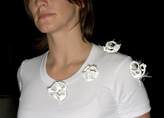
In a lot of cases a biopsy is done with a hollow needle. This means that the sampled tissue that comes out, is round on the outside. What the sample looks like under the microscope, depends on lots of things. I could not have imagined it looking like this brooch ‘Biopsy II’, by Islay Taylor.

One of the most striking things about this brooch is the reflective property of some of it. All the rougher parts, and the wires sticking out, reflect light. This is shown in the top photograph. It must have been something very dangerous coming out of that body! No matter what the medical reasons are, I love the way it looks. The rest of the brooch is white, still, not a color you’d expect of a piece of tissue. But I don’t mind, it works really well in combination with the reflective bits. So beautiful, to see the color white used as the darker part of the piece.

Another interesting thing about this work is the suggestion that something has been taken from inside the body, and then it is worn outside of the body. It is all about the luminescence of inner beauty!

2009-10-12

08Brooch 2009


I was really surprised how attracted I was to the work of Austrian jeweler Petra Zimmermann. The brooch is made of sparkles and gold embedded in a handmade plastic background. The image gives you a good idea of what her work is like, but although it is a great photograph, the brooch is not nearly as attractive as it is in reality. The shape of the brooch has a sensuality that very much comes to life ‘for real’. Also, all the crushed pearls, rhinestones, amethysts, gold leaf and fine gold catch light. This makes the whole brooch shine at you, following you, from every side you look at it. It is a good sort of shine, not a blinding one, but a multi-colored attracting one. It was evening-time when I saw the piece, so spotlights were directed at it, possibly partly responsible for the magic. The bright colors of the plastic, ties the piece together. Another background for all the glitter may have been plain kitsch, but the use of these colors takes it to a new level.

This brooch was one of the pieces displayed in Petra Zimmermann’s exhibition, ‘New Work’ at Gallery Caroline Van Hoek. All the pieces were nicely spaced out, and the gallery was well lit. Looking around felt like being in a candy shop. For a day-time impression, click here, and just wait until you get to the fourth to seventh photo.

Gallery Caroline Van Hoek is a member of Klimt02.

2009-09-15

Tools for beating


A ‘parure’ is a set of various items of matching jewelry. It is modular and can be disassembled into different parts. ‘Tools for beating’ is such a parure, made by American Seth Papac. It consists of 5 individual pieces that can be worn separately or all together in their tool bracket around the waist:

‘White knuckle’, a necklace, to me refers to boxing, a western fight sport. At the two ends of the necklace hang oval silver strips, possibly meant to harden the contestants’ hands.
‘Strike’, also a necklace, looks like a pair of nunchaku’s, used in eastern fighting. To stay true to the tools theme, they are made out of steel and wood.
The brooch ‘Club’, a very long, stiff square tube, when worn, starts beating by itself. This is also the case when is attached to the tool bracket.
‘Clench’, a ring, has to be clenched to be worn on the fingers, so the hand forms a fist (for beating).
The last part of this parure is the ‘Empty tool bracket’, which is not actually empty. The leather belt holds a very well made, smooth, spatula- like, wooden shape. Just like the brooch club, it starts beating when worn, but ‘gives’ a totally different, more gentle, kind of beating.

To have a jewel committed to beating is one thing, but 5, even though they can be assembled into one, is a bit much. But the way these pieces are made, with carefully chosen materials and incredible skill, pushes the violent nature of the work to the background. For example, the necklace ‘White knuckle’, consists of white tape, used to tie tight around the contestants’ hands, but it is tied together and carelessly draped around one’s neck. And the material of the top plate of the ring ‘Clench’, steel, could refer to real knuckledusters, or to actual tools. On top of that, its’ shape does not remind of fighting at all. This is obviously also the case with ‘Club’, the brooch.

On top of this, the artist states that this toolset is meant for beating, a fictitious job or ritual to deal with the metaphorical cleansing of his body and not someone else’s! So a very personal piece this week.

Lucky me got to experience this work in reality at Gallery Caroline Van Hoek (member of Klimt02). It is exhibited there, with 2 more parures, until October 24th.

2009-09-01

How to become an elephant


Sometimes a jewel can make you curious for its’ story, and sometimes a story can seduce you to love a jewel even more. The last is the case for me with this jewel ‘How to become an elephant’ by Portugese Manuel Vilhena. Of course now I’ll let you in on the story he wrote with the jewel:

And which flower is the most delicious? - asked the man. The one on the left, of course replied the elephant. How do you know that? First, you grow a long trunk. Then, you grow large ears like mine and a, hum, quite short tail. Ah!, and you forget nothing. Is that how one becomes an elephant? The elephant looked the man in the eye, then looked down, gently picked up the flower and said - You need patience...
in „How to become an Elephant“, M.V. 2009

A very sweet story, about how to become a jewel, by Manuel Vilhena. Starting by slowly growing all the trivial bits, without losing sensitivity towards certain areas, and not forgetting anything, to make a fully finished piece.

I can totally see the elephant in this brooch look people in the eye, while it is telling the most wonderful stories. It gets my fantasy going about great, story-telling jewels to keep you company.

Luckily there is more in the exhibition ‘How to become an elephant and other fabulous and curious stories’. Opening on the 5th of September until the 27th at galerie S O, in Solothurn, Switserland. More about the exhibit on Klimt02.

Summer has been great and now I am very happy to be blogging again!

2009-07-10

Bright red cluster 2009


There is lots of ‘recycled’ jewelry around, and to continue with the previous garbage-theme, here is one piece that really stands out for me.

Bright red cluster 2009, a brooch by New Zealand/Australian jeweler Roseanne Bartley, incorporates some of our typical bits of waste in a great way.
The red plastic bottle caps are still very recognizable, even though they have been made to look worn. Keeping their round shape, they have been cut into pieces, to become something completely different, almost floral (which is good since garbage usually is not one of the nicest smelling things;). Also, a cluster of caps is used like the way we collect our waste, before it is discarded permanently. Silver settings have been made for the invaluable bottle caps, so they are treated as semi-precious stones. The silver has been patinated black, to really set off the bright red color of the plastic. It all has been incredibly well done and thought out!

Since blogging has been hard for me these last few weeks, you now have to hurry to catch a glimpse of this wonderful piece since it is part of the exhibition ‘Winter brooches’ at Studio 20/17 in Sidney, Australia until July 11th! There is more to read about the exhibition on Klimt02.

With summer holidays fully kicking in I won’t be posting for a while. But I will be totally refreshed and ready to blog beginning of September!

2009-05-31

Ivory pets


In a flash these beauties may look like they were mass-produced, but they are most certainly not! Made from quality materials such as mammoth ivory and red laquer, the brooches were carefully designed by German Christoph Straube. They look very sleek, with their 'faces' in off-white and an alarmingly bright red colour used for their eyes. Every pet has its own unique expression, some more obvious animal-like, some almost human, and all incredibly cute.

Straube himself states on Klimt02: there is no object that exists purely on its own, it is always a part of a complex system. He regards aesthetics as a product of convention and evolution - the meaning of every object we look at is processed by our culture and perception.
I surely agree with him, and it is the reason why I am not the only one who thinks that they are cute.

The Ivory pets are part of the exhibition “Rare animals are the missing link” to be seen at ‘Galery Metal’ in Copenhagen, Denmark until the 4th of July.

2009-05-13

Waiter, there's a fly in my soup!


When I first saw this brooch, it made me smile. ‘Waiter, there’s a fly in my soup’ is the start of so many jokes. At the moment my boys love to tell jokes, to anyone who’d like to hear them, over and over again. Then I started thinking: is this a really a soup spoon? No, it must be smaller, more like a teaspoon. And is that really a fly? Well…..Yes, it is!
The Finnish jeweller Eero Lintusaari cast a dead fly into acrylic to be on display in this brooch. In real life, the fly, along with the rest of the soup, would be discarded very quickly, but Eero Lintusaari became intrigued by it. He loves the delicacy and fragility of the fly, which normally would hardly tolerate to be touched without decomposing. The fly gets magnified by the acrylic and at the same time the artist uses a smaller spoon, so the proportions are a bit off and the fly gets even more emphasized. This way, the wearer is drawn to the fly to get a better look at it’s delicate beauty. It looks like a gigantic fly in a little bit of soup.
I love a joke, but I would have reservations to wearing this one, since there is still a dead fly in there!

Waiter, there’s a fly in my soup!
Yes sir, this fly really knows good soup.

Eero Lintusaari is a member of Klimt02.

2009-03-17

Steel grey brooch


Finally, the first post about an Australian piece, by the very talented Julie Blyfield! Botanical influences have always played a big role in her work, and in her most recent pieces that influence has become more relevant due to the changing climate. In Australia, and South Australia in particular, there has been a drought for the last couple of years, which is taking its toll on trees and other plants. Julie Blyfield took a trip into the desert and noticed the adaptations to drought and bush fires of the desert plants. Their forms and colors were an inspiration for her new collection and this Steel grey brooch. I can imagine how drought makes natural materials curve like the bend in this brooch. Also, bush fires would blacken everything on its path.

In addition to observing environmental changes, Julie Blyfield also studied the body ornaments made by Aboriginal people. They use natural materials with great care leading to exquisite designs which are striking in the repetition of pattern, shape and form. In her new designs she started experimenting with a variety of materials instead of using mainly metal. This resulted in the beautiful red string used in this brooch. The contrast with the steel grey and black makes the red more vibrant. On one hand that alarming red color seems like a warning sign. On the other hand the botanical feel of the brooch makes the string look like flower buds protruding on their branch, as if spring has arrived and things are looking up.

Julie Blyfiled made this amazing ‘Steel grey brooch’ in 2009 as part of the collection Natural Selection, currently exhibited (until April 4th) at Gallery Funaki in Melbourne, Australia.

Photograph by Grant Hancock.

2008-11-13

Where's my gum


What if you're happily chewing on a piece of gum and all of a sudden it drops out of your mouth? You might think, whaa, where did it go?! But not Jiska Hartog and Michiel Henneman or the jewellery design duo 'Wanted Jewellery'; they consider it as a new piece of jewellery! They even like the idea so much that they reproduced the gum in a nice bubblegummie-pink color of plastic and turned it into a brooch. To a lot of people it might be a bit over the top, and that is exactly what they are interested in. They like to play with the expectations of the whole society of what jewellery really is. To them, not only can jewellery be an expression of wealth, it can also show your taste, and that is taken very literally in this case! Personally, I love the idea and the way it looks. Although as a hard core minty fresh gum-addict it also feels like a bit of a waste, I think I'd rather keep it where it belongs, in my mouth!

Michiel Henneman and Jiska Hartog have started 'Wanted Jewellery' in March 2007 and are based in The Netherlands.