When I wrote about
ceramic beauty I sort of promised to follow up on the process-photographs of work by
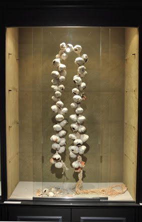
Hilde De Decker. Last Sunday was the opening of the group exhibition ‘Hitte’ (Heat in Dutch). Intrigued by the pictures I posted on the blog, I went to have a look. When I walked in, I got a warm and homely feeling, nothing like the regular exhibition space. The- very kitcheny- cupboards, displaying the work, contained lifelike, ceramic, food items. One cupboard was filled with stacks of ceramic waffles (yes, obviously from Belgium :) that looked like they had stayed in the waffle-iron for to long and got scorched black. The next one showed a full string of garlic in the shape of a neckpiece, made out of very thin ceramic, and some ceramic cake tins, dripping with rich, vanilla colored, glaze. These pieces were alternated by saddle-shaped shields; built out of thin layers of clay. To me, they embodied the human presence in this domestic setting, almost as if aprons had been taken off and left there. One of the shields even had straps with a buckle attached to it,suggesting wearability. The fact that Hilde De Decker is a jewelry artist shows through, even when she uses ceramic sculptures as a medium. In her works, the suggestion of the human body plays an important role, although not necessarily as a wearer. I was really drawn to all of the objects, because of their homey suggestion, but after a while they started to push me away. The delicious waffles: completely burnt! The cake tins, even with glaze on, were only molds and not actual cakes. The huge string of garlic looked too fragile to touch, and would smell enormously if real, not to mention the symbolism of garlic. The shields became defensive instead of protective. Like most things in life, these works surely had two sides to them!

The exhibition is also worth a visit for the quirky shape of the building, which had been restored and made into exhibition-space by
Frank Steyaert. And for the works by the other participating artists of course, such as the wonderful sculptures by
AnneMarie Laureys with amazing texture and color inside and out. And the work ‘Fever’ by Hanneke van Hage out of Persian tapestry and porcelain shoes, laid out in a certain pattern.
This exhibition runs until December 4th, at gallery and private museum Frank Steyaert, Tinnenpotstraat 16, Gent, Belgium.